

Boeing’s design system: Atmosphere
Overview
Bringing consistency to a big organization
The Boeing Atmosphere design system establishes consistent visual and interaction patterns across all digital products, ensuring a unified user experience.
By defining typography, color palettes, icons, and UI components, Atmosphere fosters brand identity and simplifies development while enhancing user familiarity and usability.
Year
2024-2026
Client
Boeing Digital Aviation provides very specific solutions to the aviation industry. Their products vary from in-cockpit softwares, weather forecast tools and aircraft management solutions.
Role & responsibilities
I was responsible for the component product design, creating and maintaining the Figma library and the token structure, and writing design documentation.
Impact
Company was perceived as strong and cohesive.
Acceleration in product development.
Technical scalability thanks to the token structure.
Better quality and accessibility
Reduced costs and risks
Facilitated innovation
Atmosphere principles
Accesible for all
We looked through the lens of our users to embrace accessibility, inclusion, and diversity. Some considerations include a dynamic type scale, color contrast, and dark to light mode flexibility.
Iterate to improve
Continuously refine the design system based on user feedback and evolving needs.
Rooted in research
Share our discoveries and insights to foster collaboration. Prioritize user needs and continuously adapt to deliver optimal user experiences.
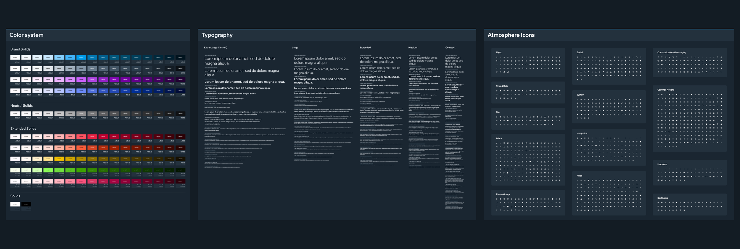
Atmosphere foundations
To ensure maximum flexibility, the design system pays special attention to color, density and layout
Color mode
The color palette and the tokens has been set up to easily swap between light and dark mode. Tokens studio was used to swap between the two modes at all component levels
Density mode
Optimised to switch between condensed and relaxed modes. Condensed mode is useful when users view or compare a lot of information. Relaxed mode excels when less content is available on-screen.
Breakpoint mode
Devices of different sizes and orientations need different layouts. The components were tailored to adapt to these changes in layout, maximising the responsiveness of the design system.

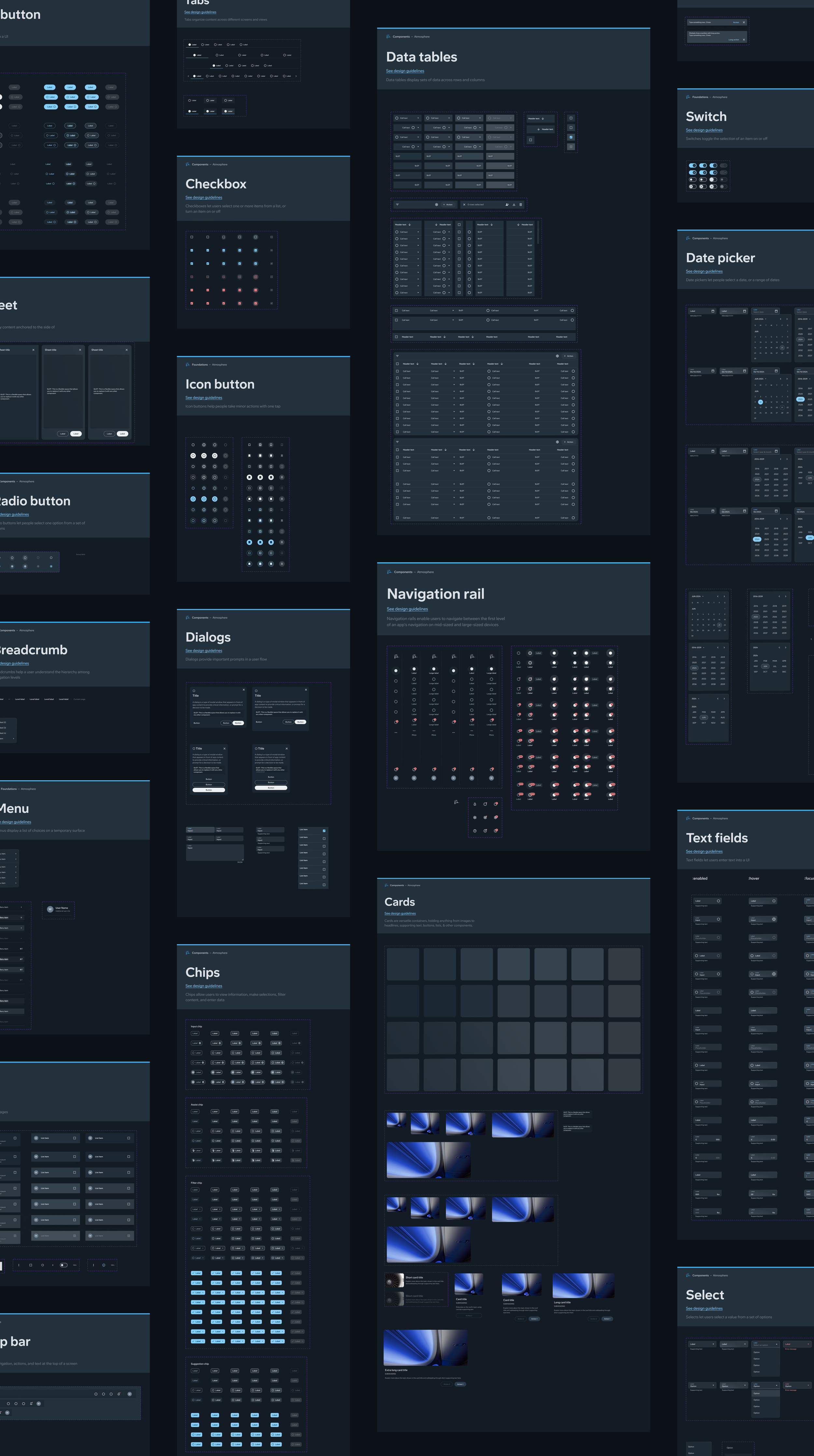
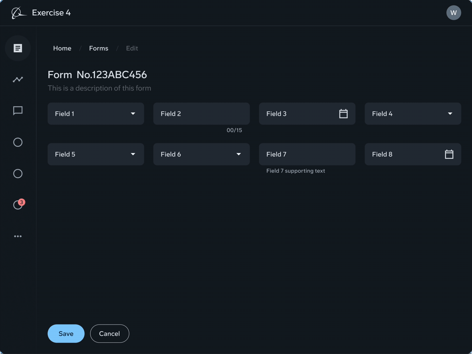
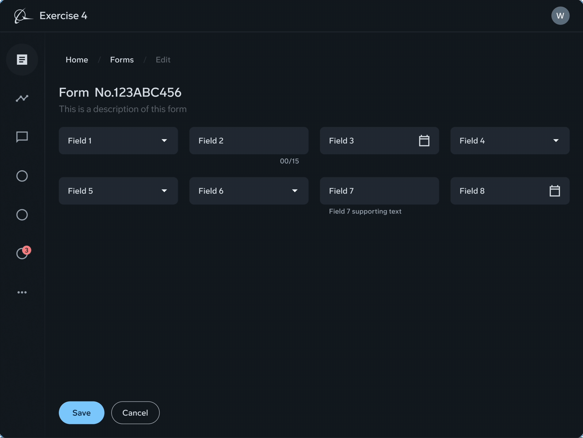
Design components
Components were carefully crafted in Figma using color, sizing and text tokens. Using Material design as a foundation, each component was adjusted to comply with Boeing’s internal use cases across products.
Glass material
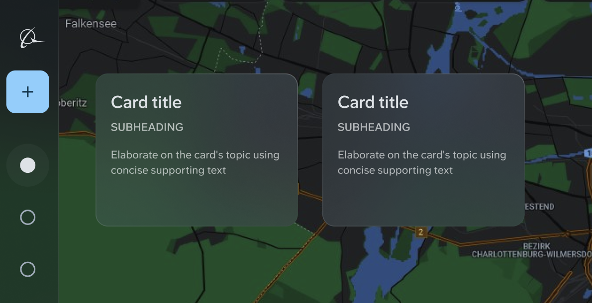
Created for overlay use cases like maps
Introducing “slots”
Allowing flexibility while maintaining consistency

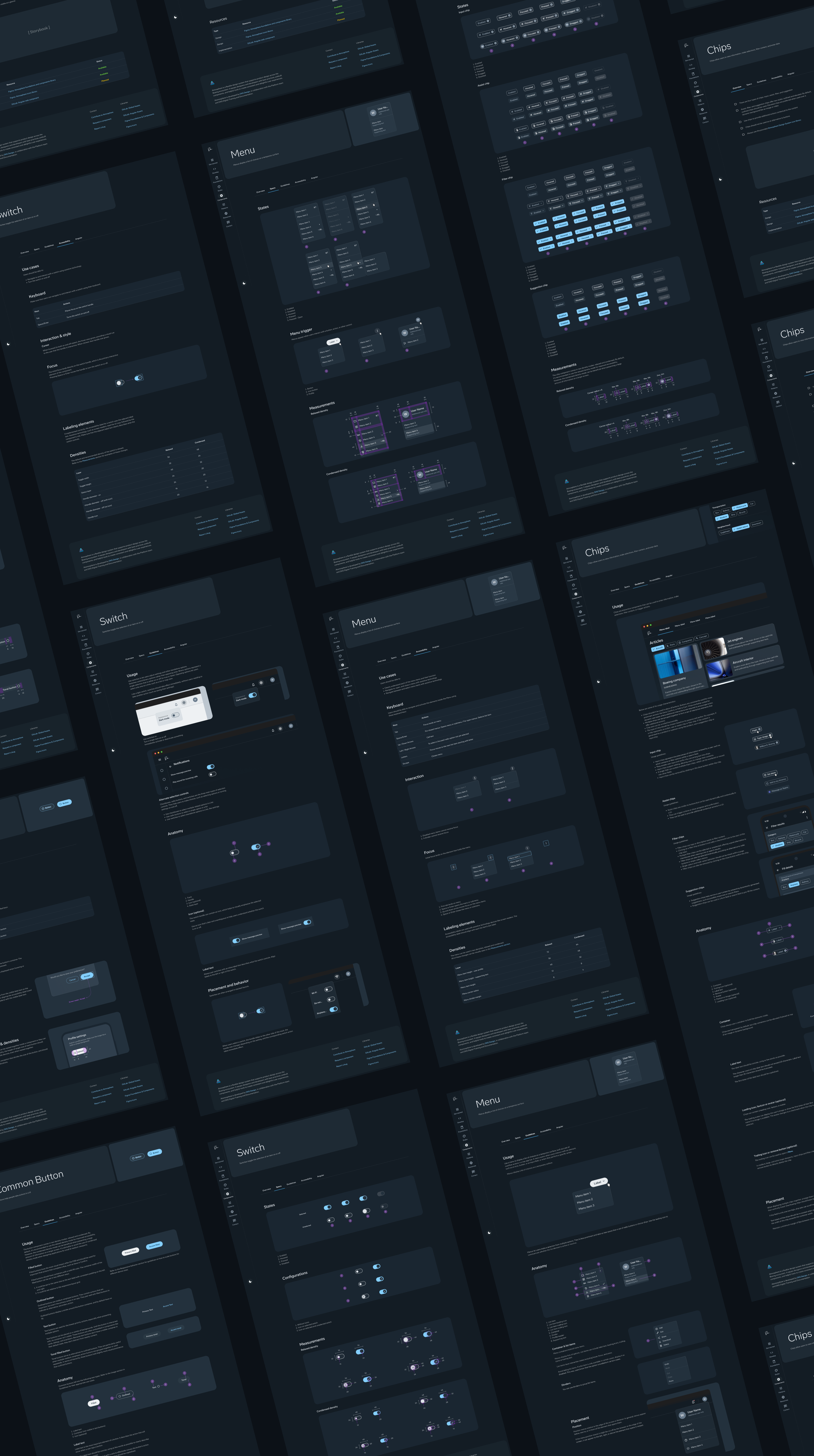
Design documentation
Guidelines are an essential part of Atmosphere. Each component has specifications, anatomy, usage and accessibility guidelines.
Patterns
Not all use cases are created equal. Pattern documentation help designers understand common uses for certain group of components

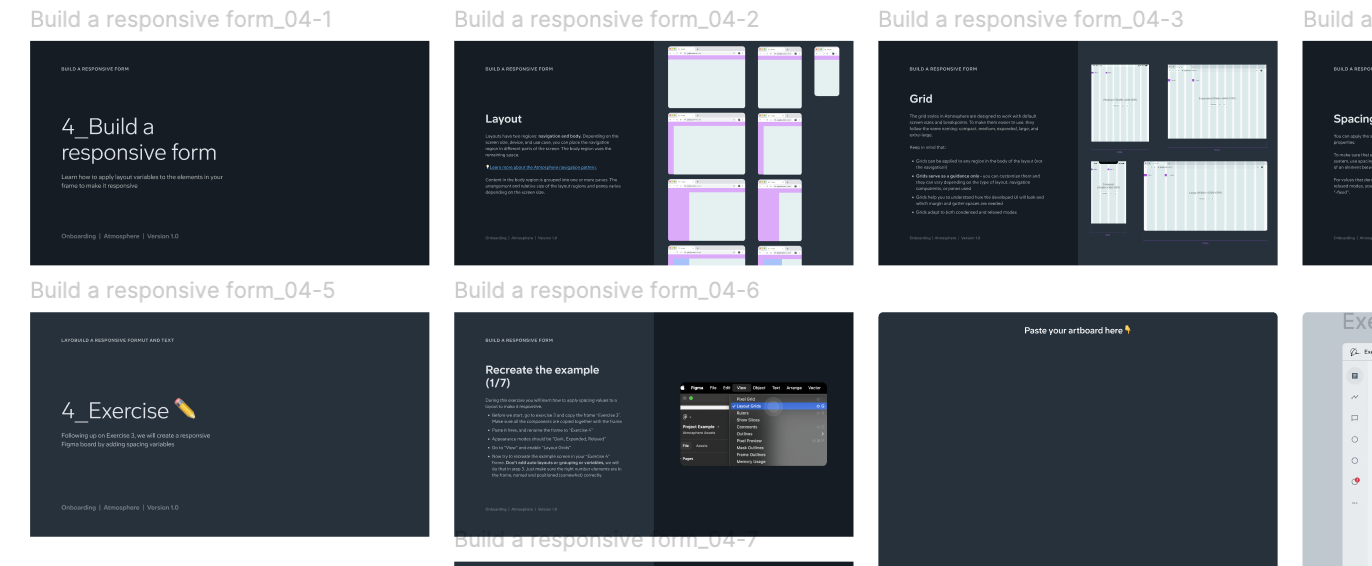
Onboarding for designers
New to Atmosphere? no problem, the onboarding guide will help you discover the foundations of the design system for you to hit the groung running
“We’ve been waiting for this for years… I really want to get my hands on it as soon as possible”
— UX designer